RESPONSIVE UI
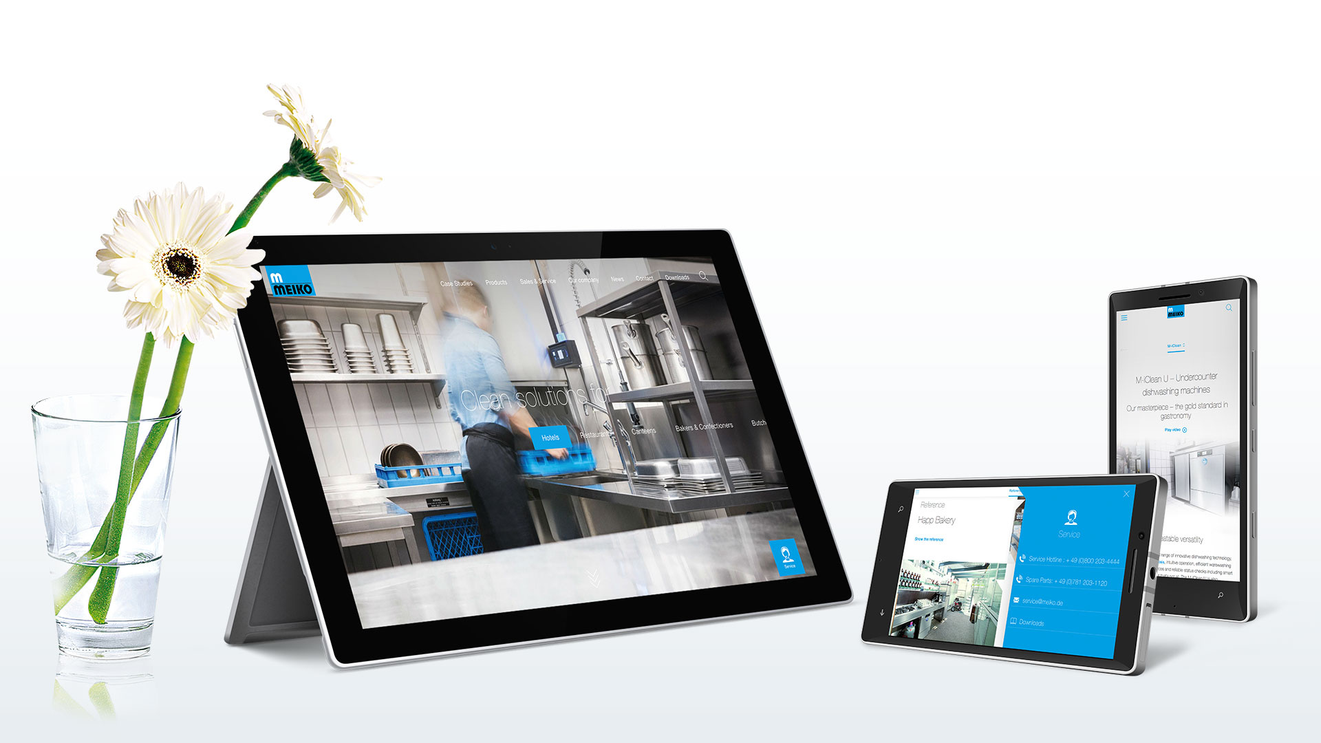
Today, online communications are accessed on a wide variety of devices. Smartphones, tablets, notebooks, TV sets and wearables are just a few examples. And the variety of screen sizes is just as wide. Web communications must therefore be accessible and usable on almost every screen. MEIKO attempts to offer the full informational content of a communication as far as possible in order to guarantee consistency of application usability across all devices. Customers should be able to find the same extensive machine information on their smartphones as at home on their desktop PCs.
To achieve this claim, MEIKO user interfaces are responsive. This means that they adapt automatically to the viewport available. Content is optimised for viewing habits associated with the screen size and scaled accordingly. This applies to fonts as well as visuals and graphics.
PERFORMANCE
In order to take account of the bandwidth restrictions of mobile networks the data volume transmitted is also adjusted. Images are scaled down on the server side and only transmitted in the scaled size actually required for the viewport. This saves on data volume and increases retrieval speed.
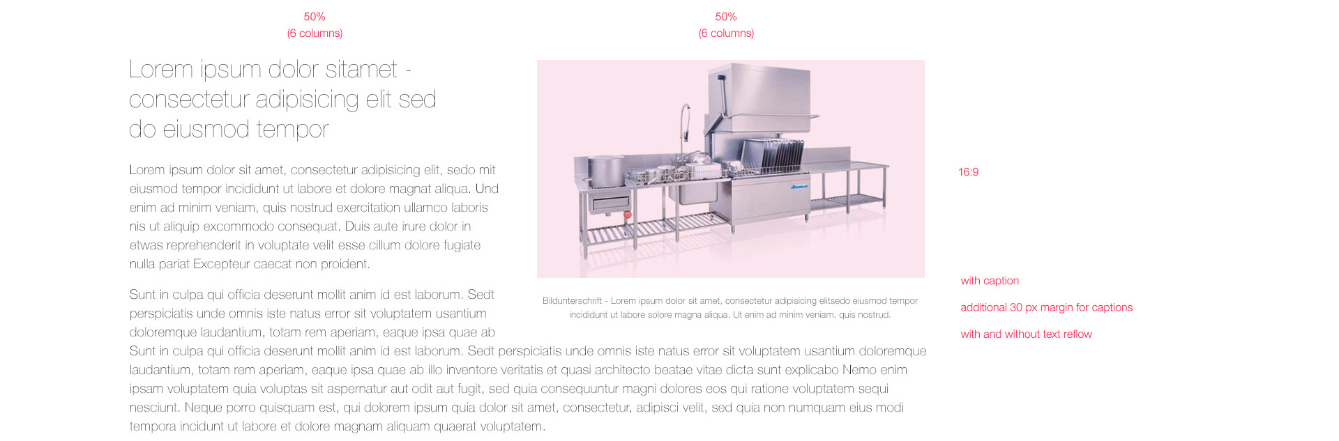
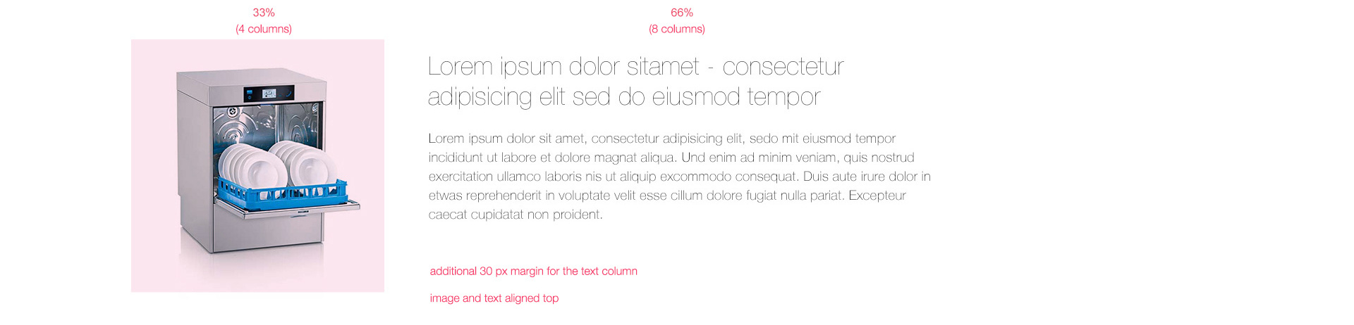
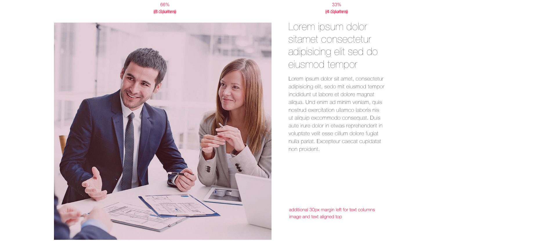
COLUMN GRID
If desired, the MEIKO websites will still use a flexible 12-column grid. Usually the column divisions 50-50, 30-30-30, 66-33 and 33-66 are used as can be seen in the examples.