COMPONENTS
BUTTONS
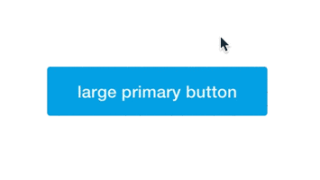
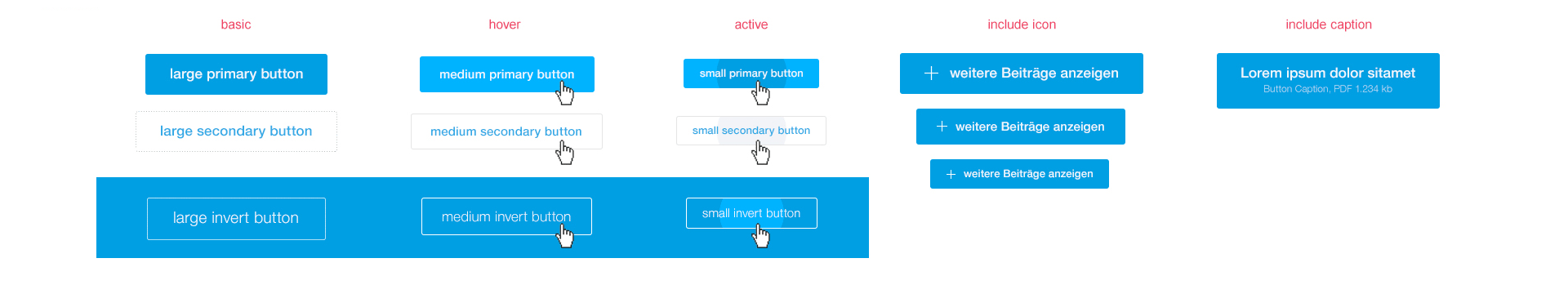
Buttons are used to highlight the user's interaction options. Buttons are available in different sizes and shapes and provide visual feedback on their status. As is usual for MEIKO, the colour choice is limited to the main colour, blue. Buttons and links can be used with or without icons.
FORMS
Forms allow the user to provide personal information to MEIKO. In order to increase user willingness to do this, it is important that forms are designed to be understood as quickly as possible. We only ask for the information that is absolutely necessary for us to fulfil the request and we provide information about the security of our customers' data.
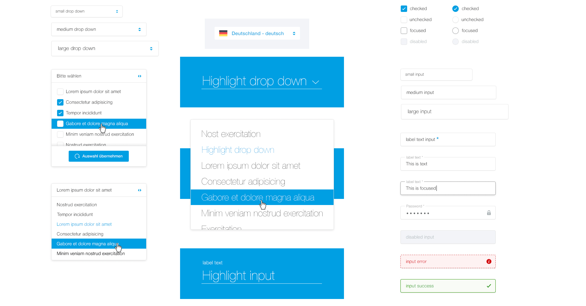
In addition to traditional input elements, MEIKO websites use a format known as "natural language forms". By integrating the input fields into meaningful query formats, such as "I need advice", user willingness to click is increased. This far-reaching design actively steers user focus and, simultaneously, prevents the retrieval of more complex information.

NOTIFICATIONS
Notifications help the user to enter data. Depending on the type of notification, it may appear in red, green, yellow or pale blue with rounded corners or dotted curves and may feature a white border to separate it from the background colour. The colour values can be taken from the example below. Notifications always appear in the user's focus, as close as possible to the relevant input field. They are clearly formulated and offer help with erroneous entries, give feedback for successfully completed actions or provide hints for interaction possibilities in need of explanation.

CONTROLS AND LOADING ANIMATIONS
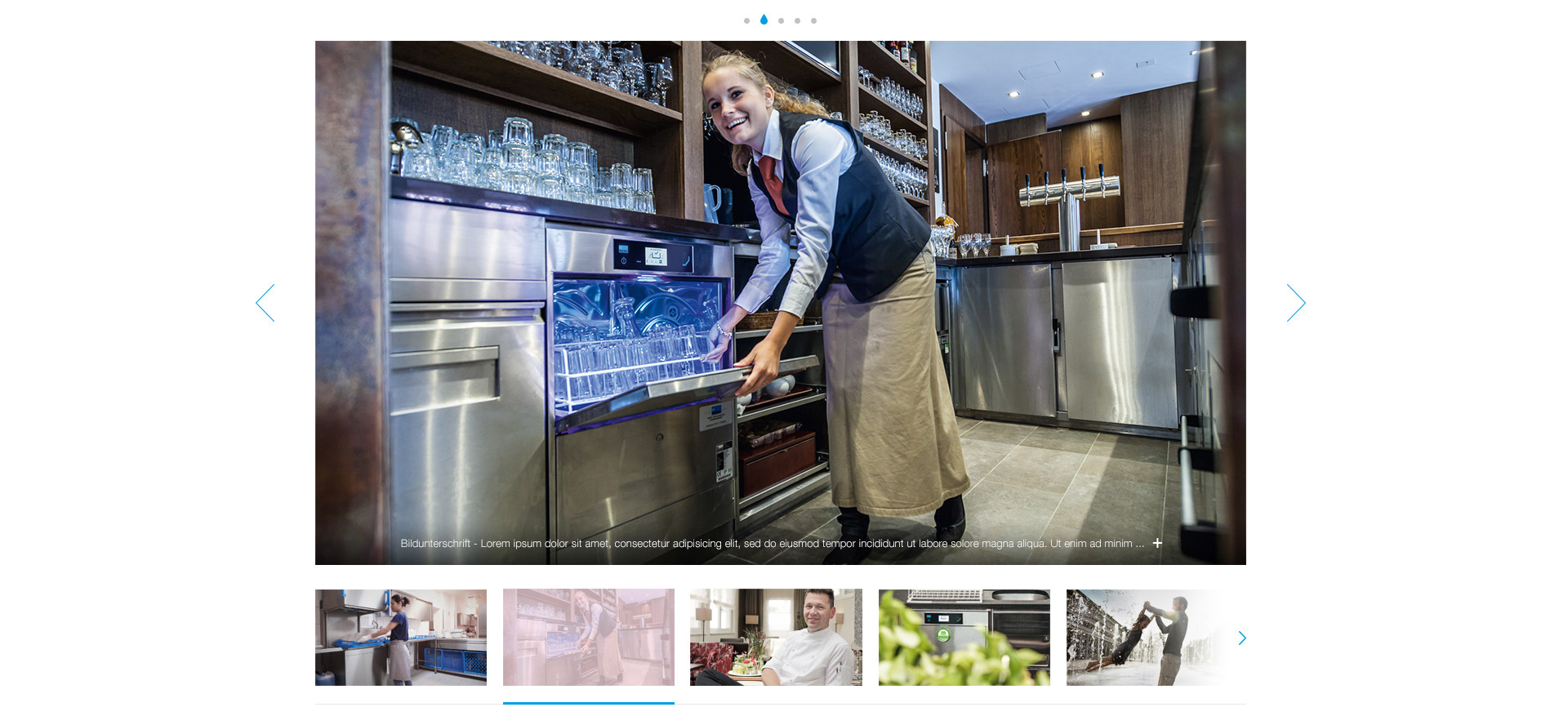
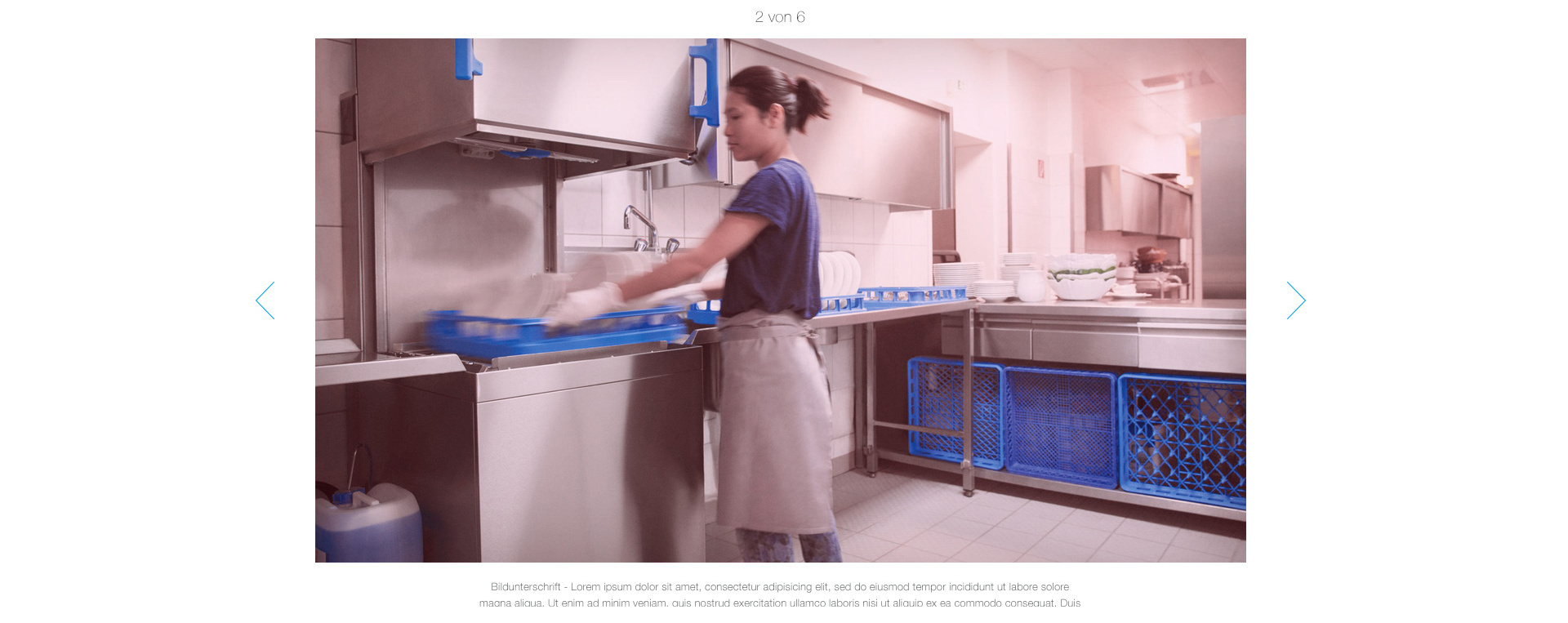
Controls are part of every web app, just like a steering wheel in a car. We use the generally accepted standard to capture repeat inputs and only adapt it subtly to fit in with the MEIKO world. For example, we shape active points like water droplets on slideshows, among other things.

CONTENT GROUPINGS AND LISTS
Extensive content can be organised more easily if it is divided into meaningful blocks. Since MEIKO technical products sometimes require more explanation, our UI design includes several such subdivision options, which can be used as required. When using these, however, make sure that only one grouping solution is used within a logical unit.
GROUPING AS TABS
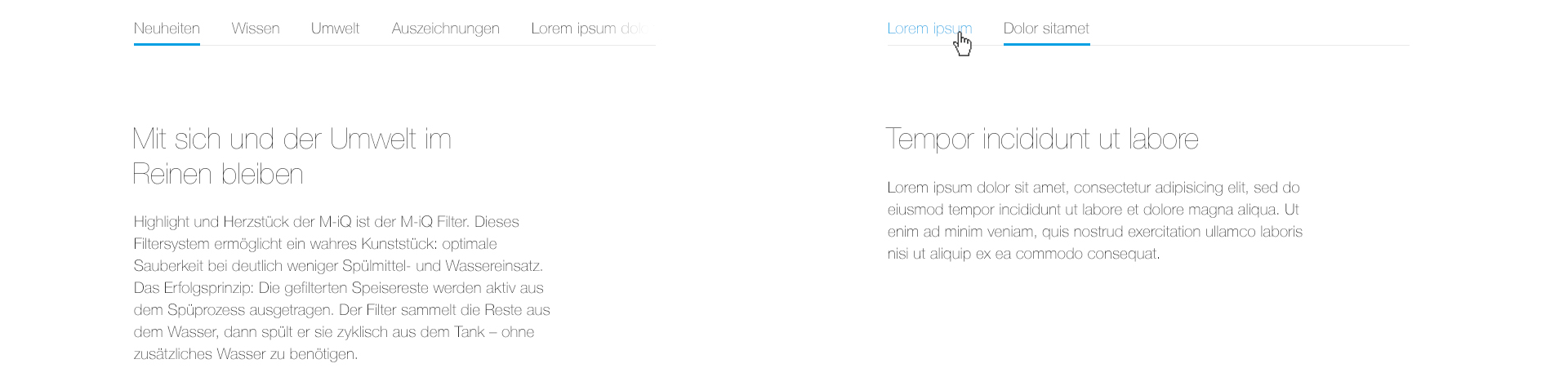
GROUPING IN ACCORDIONS
Examples of FAQ sections
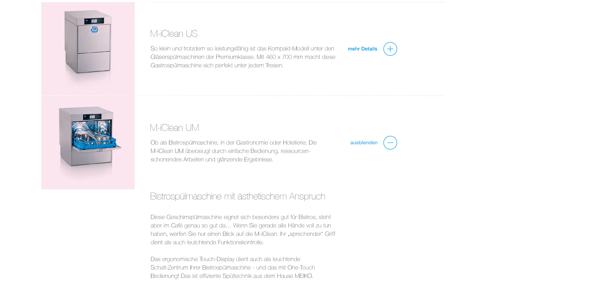
GROUPING IN ACCORDIONS
Examples of FAQ sections
TILE LAYOUTS
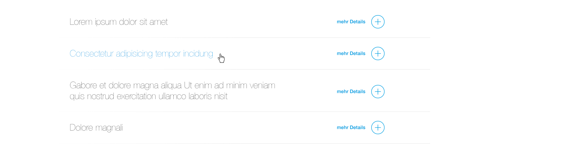
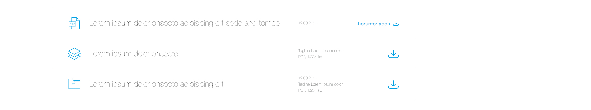
LISTS
For download sections, as an example
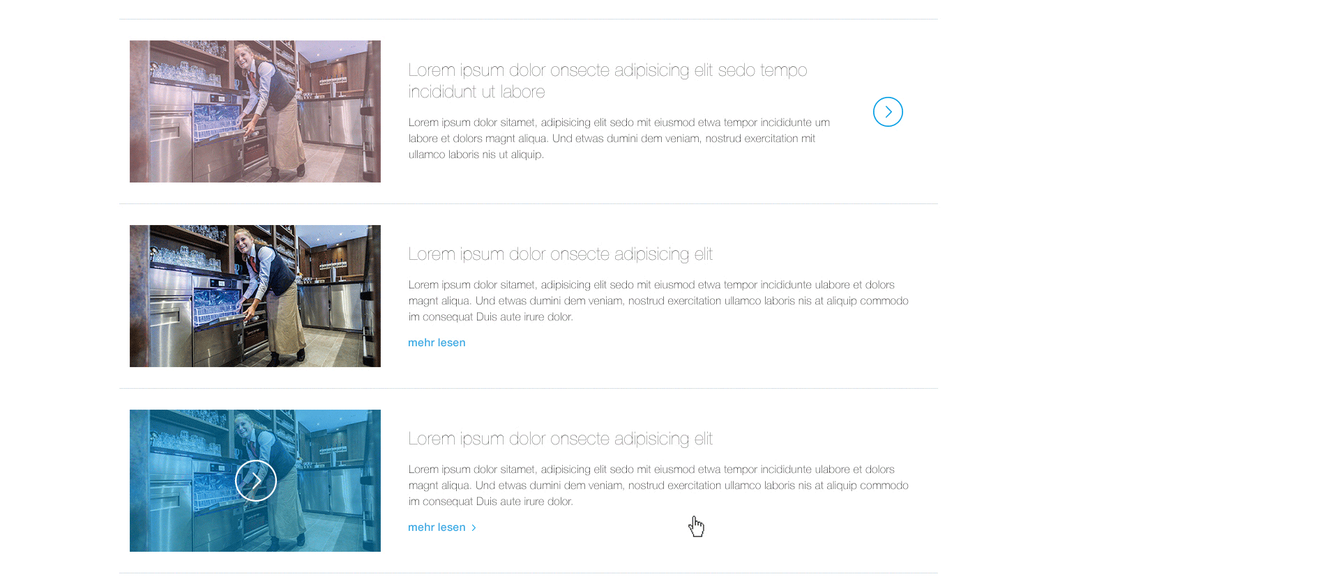
LIST FEATURING TEASER TEXTS
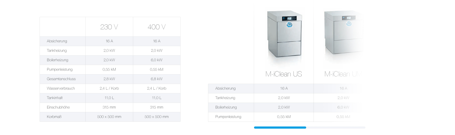
TABLES
PANELS
To highlight individual items of content
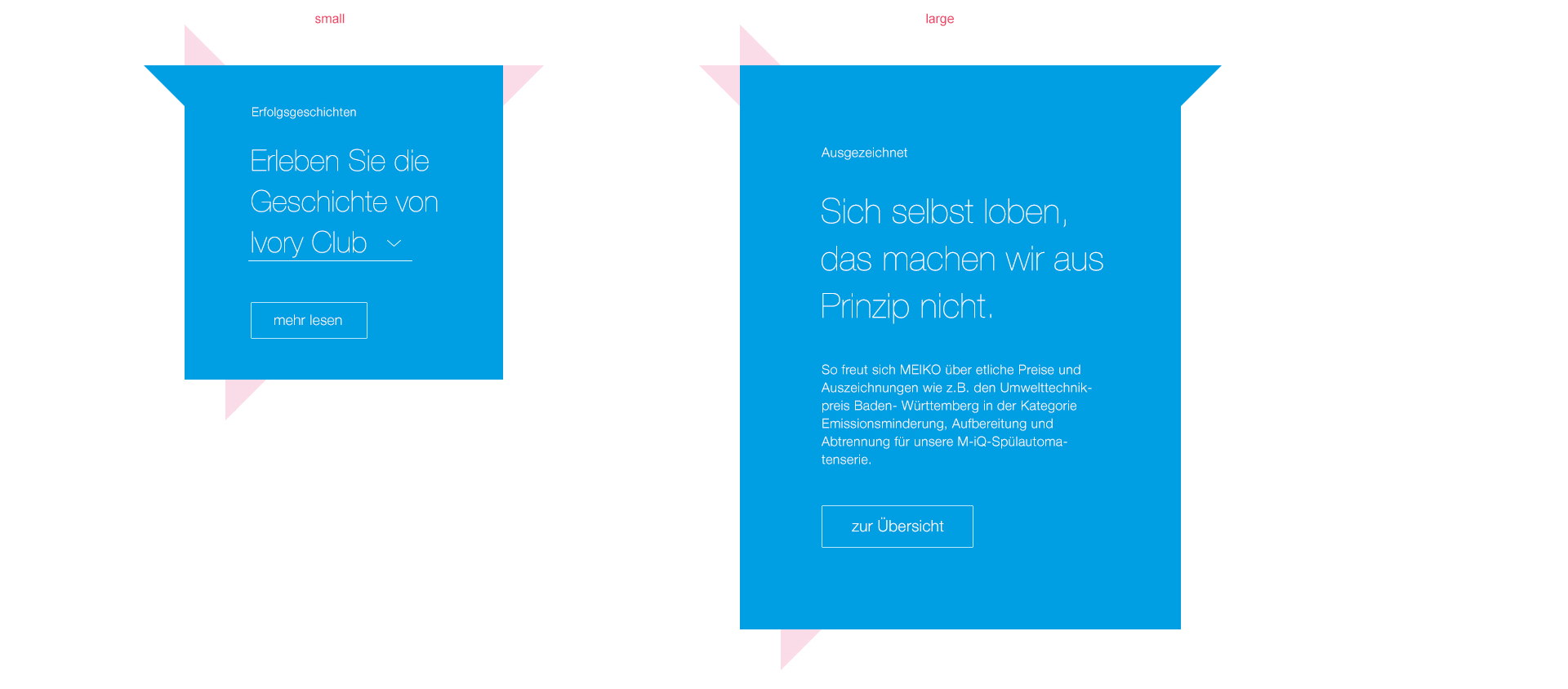
The location of the "speech bubble tails" can be adjusted in order to establish a relationship with other content items.
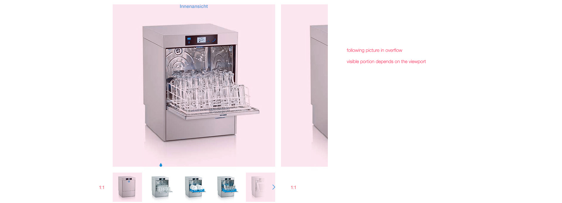
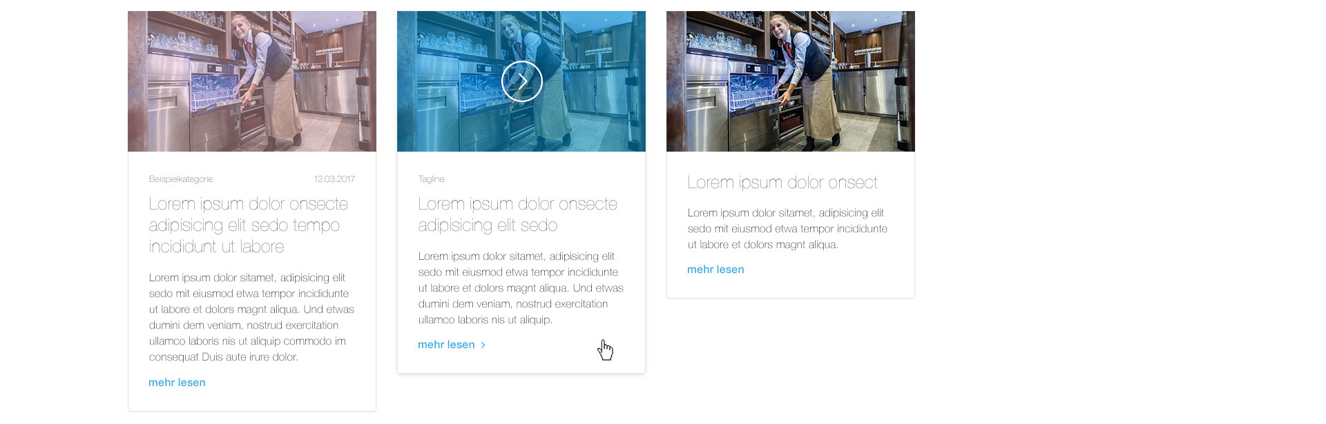
GALLERIES
As in all areas of communication, excellent visual material is valuable in digital media, be that product images or reference photos. Various gallery designs are available to give the material the space it needs.