LOGO
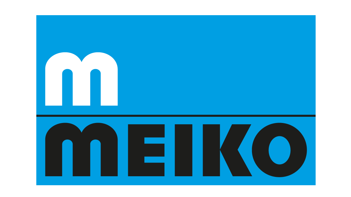
The company logo is a combination of a word mark and a figurative mark. The word mark is MEIKO. The name is formed from the surnames of the company founders of 1927, Oskar Meier and Franz Konrad.
The figurative mark is a fountain: a symbol of purity, cleanliness and renewal. The text and image in the company logo were last modified in 1968. The pictographic logo was simplified to become a „water fountain“ in the shape of an M.
HISTORY

1927

1945

1954
seit 1968
LOGO VARIANTS AND BADGES
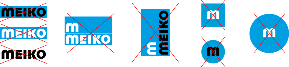
The golden rule is: never touch the logo!
The MEIKO Logos are fixed and defined in the form shown here. Changes may only be made upon request or with the express permission of company management at MEIKO Offenburg.
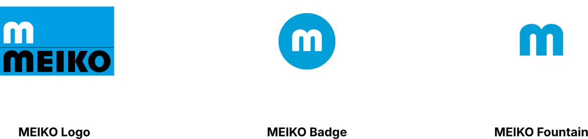
The MEIKO Badge and the MEIKO Fountain may only be used if the term MEIKO appears on the same medium. It can be used as a stylistic or design element, e.g. for product branding, corporate clothing, branding images, etc. However, it does not replace the full logo. The alignment, proportion and perspective of the Fountain symbol must not be changed.
COLOUR VARIANTS OF THE LOGOS
In exceptional cases, the basic version of the MEIKO logo may be placed on a cyan background without an outline. The MEIKO Badge and the MEIKO Fountain are used in the same way as on a dark background.

The MEIKO Fountain may be used in shades of the MEIKO colors.
See the section Corporate Colours.
DIVISION LOGOS
LOGO COLORS
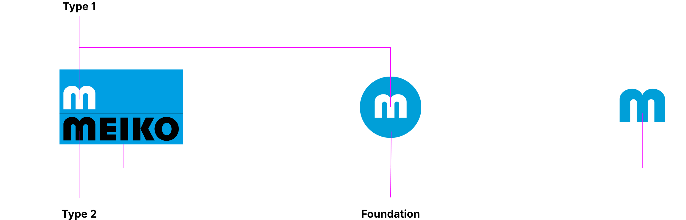
| Color | 4 colour CMYK | Solid colour PANTONE | Solid colour RAL | RGB | HEX |
| Foundation | 100 / 0 / 0 / 0 | Pantone Process Cyan | RAL 5015 | 0 / 159 / 227 | #009fe3 |
| Type 1 | White | White | RAL 9016 | 255 / 255 / 255 | #ffffff |
| Type 2 | 0 / 0 / 0 / 100 | Pantone Process Black | RAL 9005 | 0 / 0 / 0 | #000000 |
LOGO ARCHITECTURE/SIZE
The logo architecture may not be changed. Any change in logo size must be achieved by scaling the master logo in proportion.
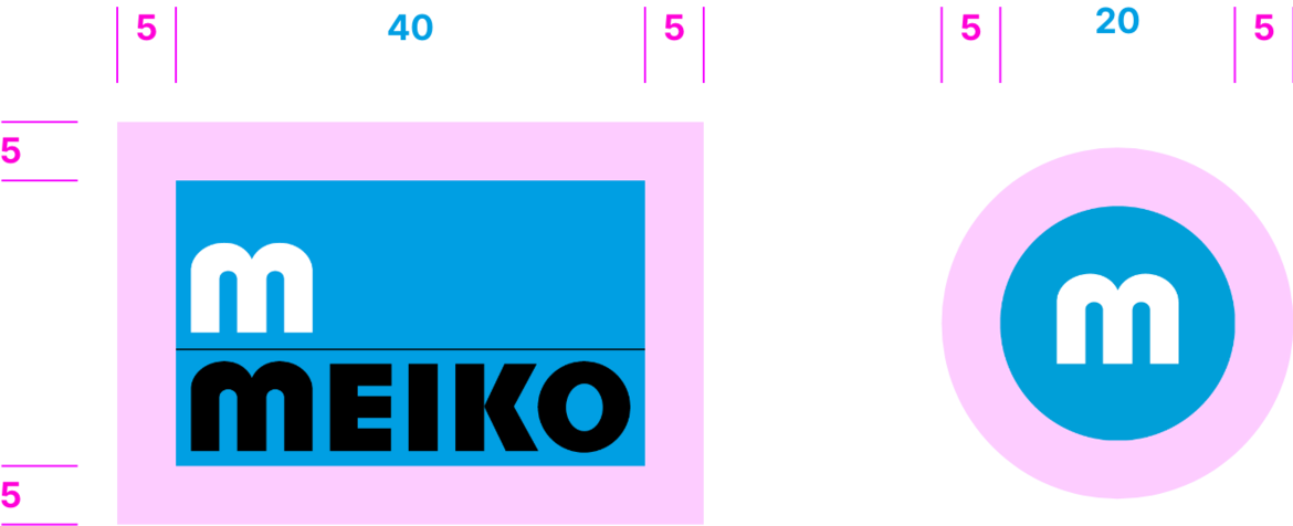
The logo’s protected area is the minimum area around the logo to be kept clear.
The protected area is the space needed to prevent interference with the effect of the logo by adjacent design elements. This ensures that the logo will be recognised quickly and easily.
The protected area for the logo has been set at a minimum of 5 mm (print) or 10 px (digital) from the master logo.
When the logo is scaled up or down, the protected area is also scaled in proportion.
FORMAT IN TEXT
MEIKO is always written in capital letters in headings, sublines and copy text. Press releases are an exception to this rule.
This is how we continue to develop MEIKO technologies.
